Take a hundred Western retirees who land in Thailand or the Philippines at sixty-five, and ask the only question that matters for someone deciding: how many are still there a decade later? Model it honestly. Apply the rate at which people go home and the rate at which they die, year by year, and the answer is about thirty-five at eighty, eighteen at eighty-five, six at ninety. The cohort does not stay. It decays, and it decays fastest at the ages the move was sold as permanent.
There is no measured return rate to quote, and a companion piece sets out why: the institutions count people abroad and people who die abroad, never people who went home. That piece bounds the silent cohort from three directions and refuses, correctly, to launder a soft figure into a hard one. This piece does the next thing. Rather than guess a number, it builds the curve from inputs that are themselves sourced, runs the uncertain one as a band, and shows what the rate must look like. What follows is a transparent model, not a measurement, and not advice; every parameter is stated so you can disagree with it on the arithmetic.
The two hazards
A cohort decays through exactly two exits, and the trick is that one is well-measured and the other is not, so you handle them differently.
The first exit is return. The cleanest measurement that exists is the 2025 Population Studies follow-up of Dutch pensioners abroad, which matched 5,065 retirees across forty destinations to the actual return register. About 9% had gone back within three years, against fewer than 5% who said they would. And even among those certain they would stay abroad indefinitely, 4% had returned inside three years. Intention underpredicts return; a hazard read off behaviour is the only honest one. Nine per cent over three years annualises to roughly 3.1% a year, and that is almost certainly a low floor for a Briton in Chiang Mai: the Dutch retire into a softer welfare and reciprocal-care backstop, with a gentler floor under failure. So the model uses 3.1% as the bottom of the band, not the centre. The benign path holds the return hazard at 2% a year, the central at about 3.5% rising after seventy-eight as forced repatriations cluster, the adverse at about 5.5% rising. That spread is the honest width of what we do not know.
The second exit is death, and here there is no need to guess. Age-specific male mortality is one of the best-measured quantities in actuarial science. The SSA and CDC 2021 life tables put the male annual probability of death at roughly 1.5% at sixty-five, about 4% at seventy-five, 6% at eighty, 10% at eighty-five, and 17% at ninety. It roughly doubles every seven to eight years. If anything an expat abroad faces a baseline somewhat worse than this, through accident exposure and thinner emergency access; the destination does not improve the curve. So the mortality leg enters the model as a known quantity, applied without a band.
One hazard you bound with a cone of uncertainty; the other you read off a table. Together they define how the hundred decays.
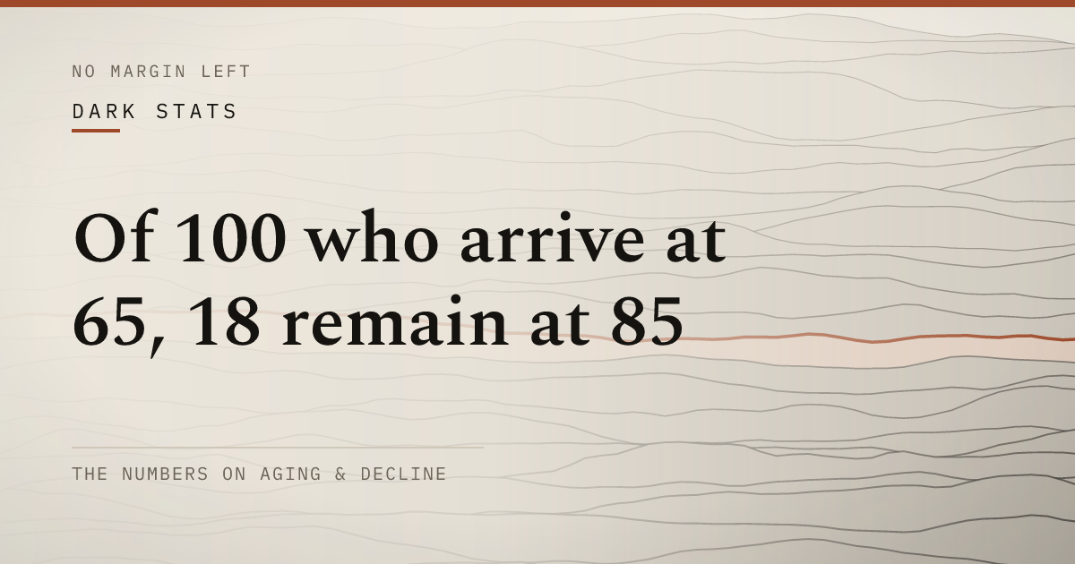
The stay-curve
Run both hazards on the cohort year by year, deaths first and then returns among the survivors, and the stay-in-place curve is this.
Source: Cohort-decay model: Dutch return hazard (Population Studies 2025) × SSA/CDC 2021 male mortality, competing risks · checked 2026-05-22
Read the central line. Of the hundred who arrive at sixty-five, about seventy-five remain at seventy, fifty-four at seventy-five, thirty-five at eighty, eighteen at eighty-five, six at ninety. The benign path, generous on the return hazard, still falls to sixty-three at seventy-five and twenty-seven at eighty-five. There is no setting of the dial that produces a flat line, because the mortality leg alone, with zero returns, would already pull the cohort down hard past eighty. The “most people stay” claim is, precisely, a claim that this curve is flat. The curve is not flat under any assumption a defender of the claim could reach for.
What the curve says
Two things, and the second is the one the curve makes legible that prose cannot.
First, the survivors you can see are the top of a falling curve, sampled at the front. The arrival video, the cost-of-living spreadsheet, the active members of the Facebook group are all drawn from the people still in place, which the model says is a shrinking minority of any cohort by the mid-seventies. A median computed over them is a median of the people for whom it is still working, with everyone the curve has already removed silently dropped from the denominator. That is survivorship bias with a shape attached, and the shape is steep.
Second — decompose the exits, and the part no brochure shows comes into focus: where did the missing go?
| Age | Still in place | Returned home | Died in place |
|---|---|---|---|
| 65 | 100 | 0 | 0 |
| 70 | 75 | 15 | 9 |
| 75 | 54 | 27 | 20 |
| 80 | 35 | 34 | 31 |
| 85 | 18 | 41 | 41 |
| 90 | 6 | 45 | 49 |
Counts are of the original 100 arrivals; 'returned' and 'died' are cumulative. Returns dominate early; mortality overtakes them by ~90.
Source: Cohort-decay model, competing-risk decomposition; deaths-abroad floor per how-many-actually-go-home · checked 2026-05-22
The two silent exits are not just large; they are comparable. By eighty, of the original hundred, roughly thirty-four have gone home and thirty-one have died in place — the two columns the visible sources never show are, between them, the majority. By ninety the dead-in-place cohort overtakes the returned one. This is the mechanism behind the deaths-abroad floor: hundreds of Western nationals die each year in Thailand alone, and the model says why that number is structural rather than tragic exception. It is one of the two ways the curve comes down.
Why the curve bends where it does
The decay is not uniform. It is gentle in the sixties and brutal in the late seventies and eighties, and that timing is the cruelest feature, because it is the inverse of the sales pitch. The move is marketed as permanent precisely to the cohort entering at sixty-five, and the curve bends hardest fifteen to twenty years later, when both hazards are compounding at once.
The late return spike is not a change of heart. It is an evacuation, and the site’s other work names its drivers: the drawdown reaching its zero year, the frozen pension compounded by two decades of currency decline, the cover that lapsed at the age it was most needed. These are the forces that turn “I’ll just go home if it goes wrong” from a plan into a wager exercised under duress. And the mortality leg, climbing in parallel, ensures that for many the question of whether to go home is settled the other way — counted not in any return statistic but in the repatriation of a body. The curve bends down hardest at the exact ages the brochure insists you will be settled.
Contest the model
The credibility is the transparency, so here is everything load-bearing and the direction it bends.
The return hazard is the uncertain input, which is why the whole thing is run as a band rather than a line. Its floor (3.1%/yr) is sourced but borrowed from a population with a softer backstop, so the true central rate is more likely above it than below — the model’s central path is, if anything, conservative on returns. The mortality input is well-measured and not in genuine dispute; the only adjustment a critic could argue is upward, for expat excess risk, which steepens the curve. The model is built on Western males, the modal solo-migrant case; a couple changes the social dynamics and a woman shifts the mortality leg favourably, but neither flattens the curve to the brochure’s implied line.
What the model does not do is claim to be a measured return rate. None exists, and the companion piece is the honest account of that absence. This piece is the structure built on its bounds: given a sourced return hazard and a known mortality table, the stay-curve cannot be flat. The single number the arrival economy implicitly asserts, that essentially everyone who moves stays, is the one shape the arithmetic forbids. Re-run it the day a real return register exists. Until then, the curve is more honest than the flat line it replaces, and the flat line is the one you were sold.
This article presents an original model, not a measured statistic, and is analysis rather than advice. The return hazard is sourced from a different population and run as a deliberately wide band; the mortality input is from the SSA/CDC 2021 life tables. Outputs are illustrative counts for a stated set of assumptions and will change with different ones; they are not a prediction about any individual. Verify any financial, medical or immigration specifics with a licensed professional before acting.
Questions
What percentage of expat retirees stay abroad long-term?
No agency measures it, so the honest method is to model it rather than quote a number. Building a cohort-decay model (100 people arriving at 65, removed each year by either returning home or dying in place), the central scenario leaves about 54 still living in the destination at 75, 35 at 80, and 18 at 85. The benign version leaves 63 at 75 and 27 at 85; the adverse, 44 and 11. Under no plausible assumption is the curve flat, which is what the "everyone stays" story silently assumes.
How is a retiree cohort-decay model built?
You take a starting cohort, here 100 Western male retirees arriving in place at age 65, and apply two competing annual hazards. The first is the return hazard: the chance of going home that year, anchored to the only clean measurement available (a Dutch follow-up of 5,065 retirees found about 9% returned over three years, roughly 3.1% a year, treated as a low analogue). The second is mortality: the well-measured age-specific male death rate from the SSA and CDC life tables, rising from about 1.5% at 65 to 17% at 90. Run them year by year and you get a stay-in-place curve, plus a decomposition of everyone who left into those who returned and those who died.
Do more expats die abroad or return home?
Under the central model the two are close in size, and which dominates depends on age. Early on, return dominates: the disappointed years-one-to-three exit. But mortality compounds faster late, so by around age 80 the cumulative counts cross: of 100 who arrived at 65, roughly 34 have returned home and 31 have died in place by 80, and by 90 the dead-in-place cohort (about 49) exceeds the returned (about 45). Both are large, and both are invisible in the content made by the people still there.
Why model the return rate instead of just citing one?
Because any single cited rate is either a guess or borrowed from a different population, and the data system that would record returns does not exist — stock and deaths are counted, "went home" is not. A transparent model is more honest than a borrowed number: it states every input, runs the uncertain one (the return hazard) as a band rather than a line, and lets you re-run it with your own assumptions. It does not claim to measure the rate. It shows what the rate must look like given inputs that are themselves sourced, and that shape already contradicts the flat line the brochures imply.